

 I’m pretty bullish on the effects of airline branding — I think that giving an airline a sense of character helps to set the expectations that are so key to the passenger experience — but the real key is making a disparate set of logos, wordmarks and other aspects of the experience work together as a whole.
Where would Virgin Atlantic be without its red shoes? Where would Singapore Airlines be without the sarong kebaya? Air India without its steaming trays of delicious curry? Fiji Airways without the cheerful ‘Bula!’ greeting? Air New Zealand without its striking black planes? Think of Qantas’ recent pair of “retro roo” heritage aircraft, and keep an eye out for the passengers of all ages thronging to look at them whenever they land at one of Australia’s airports.
Yet missteps are common: what about the British Airways world tails, beloved of many aviation enthusiasts but derided as un-British by conservative politicians at the time? Or the return of Japan Airlines to the iconic tsurumaru red crane logo after an interim period with just a red swoosh?
Branding and identity is important. It helps passengers to figure out what to expect from an airline, particularly at the top and the bottom of the #PaxEx scale.
Ryanair, for example, built an incredibly strong brand that shouted “very cheap product”, from the high-vis fluorescent accents in the cabin to years of Comic Sans style typography that made it look cheap and nasty…with an emphasis on the cheap. Compare that with the efforts made by Emirates to bling out their business and first class products (which now look tacky) and Etihad to completely revitalise its entire brand identity, even if its latest hard product is now very average in economy and business.
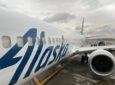
And so to Alaska Airlines, which yesterday rebranded in an attractive simplified and modernised version of its iconic Eskimo livery. Some observers noted its familiarity to Alaska’s hometown Seattle Seahawks (pointed, given the current Battle for Seattle between Alaska and Delta)…
Coincidence? pic.twitter.com/L0lsL9d1eM
— Jon Ostrower (@jonostrower) January 26, 2016
…while I couldn’t help but be struck by the colour palette’s similarity to Air France-KLM’s LCC Transavia’s old livery.
I still like the old @transavia livery #avgeek #planespotting pic.twitter.com/fJsGOxvAvV
— Aviation Photos (@luchtvaartfotos) January 25, 2016
Yet it’s difficult to overstate how crucial it is that the Alaska Airlines staff themselves are excited.
So amazing seeing how excited all the @AlaskaAir employees are about the new look! #avgeek pic.twitter.com/fqaqnD5mcS
— Airline Reporter (@AirlineReporter) January 25, 2016
I feel like I’ve been banging on about the importance of cabin crew a lot recently, but the fact remains that even when hard product is sub-par, how an airline’s staff treat you from beginning to end of a journey can make an everyday trip above average and memorable for all the good reasons. It’s hard to think of how a plane with a smile on it and a brand with a modern look to it goes badly for an airline in terms of getting its people excited and feeling like they’re part of something fun, cool and up to date.
That excitement and those feelings have a great chance of spilling over into the airline’s wider passenger experience.