


Now that the meetings, vision boards, artwork, strategy sessions, approvals, and official date for the rebranding of Dragonair (KA) to Cathay Dragon are over and done, the real work can begin: that of repainting the fleet with an intensely detailed livery imbued with a hidden cultural and historical significance.
On 21 November 2016 Dragonair ceased to exist. The change in identity to that of Cathay Dragon, with a deep red version of Cathay Pacific’s (CX) green brushwing logo, was smooth, though accompanied by some noticeable shifts, like the shuttering of the @dragonair Twitter as social media consolidates under the @CathayPacific handle, and the gradual passing of some Cathay mainline routes to Dragon, outside the usual KA China network. CAPA details a few of these, stating:
Dragonair has expanded out of its mostly China niche to take over Cathay’s Penang service and launch flights to Denpasar Bali and Tokyo Haneda, supplementing Cathay services and giving the two a larger group presence. The boldest move yet is Dragonair taking over the Kuala Lumpur route from Cathay in 2017. Cathay will transfer five A330s to Dragonair, more than what is needed for four daily Kuala Lumpur flights, indicating that more transfers are likely.
The transition has been so seemingly painless that it bodes well for the carrier’s fresh start. It is, to use a phrase so popular in China and Hong Kong, an auspicious beginning. That word, “auspicious,” means favorable, being inclined to success, and it’s a theme woven into the design of the new livery, whether you’re close enough to the fuselage to appreciate the details or not.
 In the December 2016 issue of Cathay Pacific’s Discovery magazine, the article “Nose-to-Tail Makeover” by Phil Heard explains that Dragonair passengers so loved the original red dragon logo that it has been transplanted, now appearing below the flight deck window, near the nose of the aircraft. It carries profound significances forward through the motif’s design:
“The dragon in its new form represents power and sustainability, and the red indicates that this is a fire dragon. In Chinese mythology, dragons are formed from nine other creatures, including a serpent’s body, indicating power, and an ox’s ear, indicating gentle, peaceful intelligence. The claws are from an eagle, and the number of claws – five – demonstrates the significance of the company’s size.” Wait–it goes deeper. According to Alvin Yip, senior cabin projects engineer, the painting of the dragon is more than just a red stencil: “The dragon is two-tone, with the scales in a darker shade of red, but is painted on with a colour-fading gradient to give it more life.” Even the groupings of the scales are done in auspicious numbers and hand-painted.
By the end of 2017, only 17 of the entire 42-strong fleet are expected to have been repainted. It’s no quick visit to the salon; each aircraft requires at least two days for the old paint to first be stripped, and the airline must keep to its maintenance program. Once the aircraft is primed, a base coat applied, and the design stencils readied, the application of the new look commences with an attention to detail requisite of a true partner to Cathay Pacific. And that’s exactly what they’re going for.
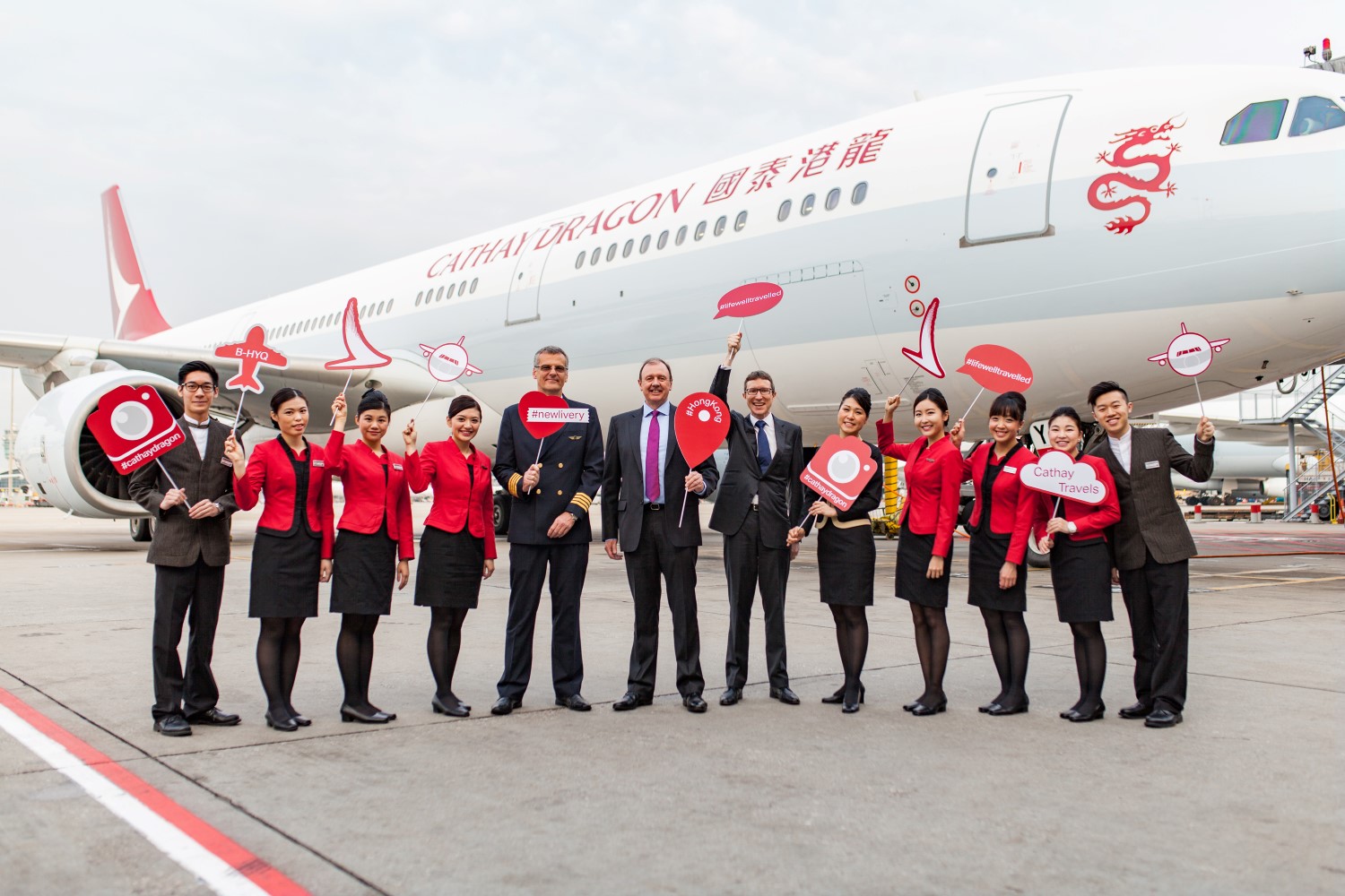
Cathay Dragon celebrates the first flight of the new livery, to Bejing, in April 2016. Image: Cathay Dragon
Related Articles: